
Following on my series of posts about Sales Insights, I thought I would learn more about Customer Service Insights.
Sales Insights, in my view, is all around making the sales process more effective reducing the time spent editing data, highlighting activities that a sales user should be doing and tracking activity with your customer. Sales Insights includes forecasting and predictions as well to allow a better understanding of what makes a sale and what is preventing closing deals.
Customer Service Insights seems to be a more typical “Insights” application where a service manager can get an overview of the current state of the Service team, measure the level of KPIs and drive understanding of the bottlenecks.
TL;DR
Customer Service Insights provides a great suite of reports to visualise a servicing centre. It allows AI categorisation and grouping of cases to highlight patterns in your case resolution, ensuring you can quickly reduce bottlenecks. It also highlights areas where you should create FAQs or Virtual agents for your more frequent case categories.
At £56.60 per user per month, it is not an application you would give to all your support users, but service managers would definitely benefit from the insight into their organisation it brings. With the ability to generate your own reports via Power BI, one license could open up possibilities for combining this data with other sources in your board packs or daily reporting scenarios.
Setup
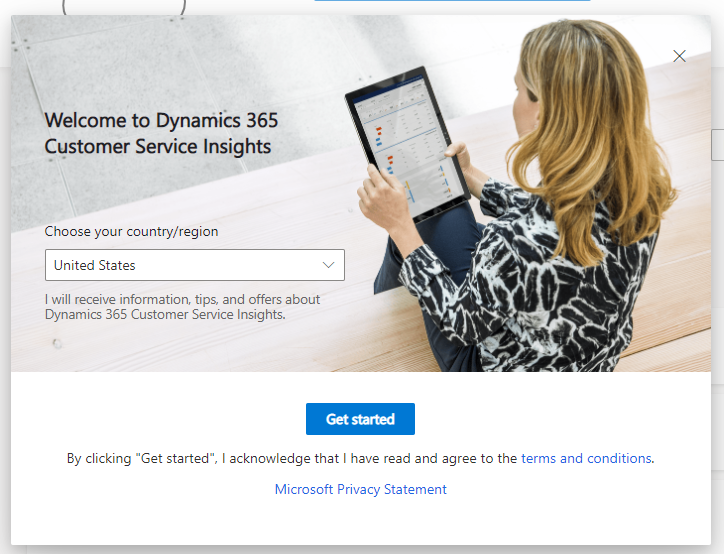
Start with a trial. It is free to sign up. Head over to the Microsoft site here and select Get started.
Choose the region and select Get started.
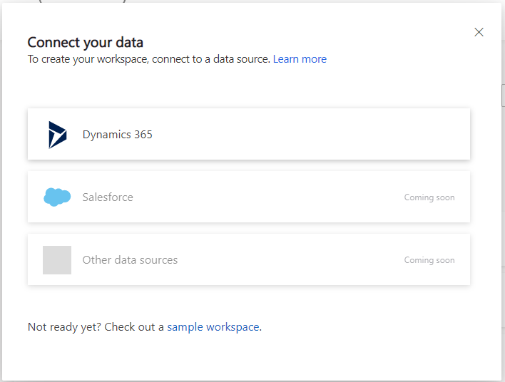
Now you need to connect your data. Good to see Salesforce and other data sources are coming soon. I selected the only choice, Dynamics 365. This then prompts you for an instance to use, select the most appropriate.
It then goes and looks at your data. Nice animation!
Once done, you are presented with the base screen for Customer Services Insights, with a banner warning you that it is not quite ready yet.

It is that simple! Unfortunately for me, I am working with OOTB demo data. My data range is very limited. This is where I rely on Power Automate to generate some case data. I documented this in my previous post here.
Now that the data is available, time to walkthrough the application and it’s features and benefits.
The information is refreshed daily. Be patient, particularly if you are changing things. The date of the last refresh is visible in all the screens, top left.
Home
The home page has lots of useful stats on your topics and tools to help you. Top right, you can define the timeline between 3 options.

The first section is Topics to Watch. This gives you 3 topics that are high in a combination of the number of cases, negative CSAT score and an increasing volume of the number of cases over the time period you select. So, over the last 30 days, App sulfamethoxazole/trimethoprim damaged was highest overall. You can also see the 3 ratings below.
Next comes Topics Impacting resolution time. This shows the highest time to resolution for these topics, with shortest, average and longest time period show. Drill down to the topic to see who is performing well in this topic and do a bit of cross-learning for those that aren’t.
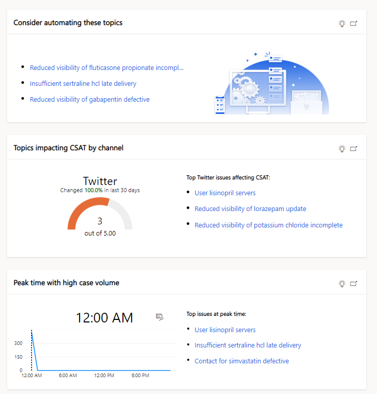
The next section highlights topics that could be automated. This means that the resolution time is quick (or simple) and the number of cases is high. Automating these cases could drastically reduce the impact on your support desk.
Next shows the impact of channels on the CSAT score. Ensure your users are trained and skilled in responding effectively in each medium. It also shows the channels that problems are surfacing on. Be careful to ensure the channel has the appropriate time to react.
Finally, the time at which cases are raised over the last month is shown. In my data, as I mentioned, the create time was not used, so shows as blank. This little graph shows you the peaks and troughs in case creation which allows you to alter shift patterns to increase the helpdesk users at those times.
Drilling into the topic presents you with Topic analytics page.
Topic Analytics
This gives you a snapshot of all scores gained from analysis of the cases and insights into how this type of case is fairing in your business. In the top right, you have the option to Automate this topic (only sends you to the website, does not bring anything through from the topic) and to rename the topic. Here you can re-label the generated topics, to ease the tracking etc. This applies throughout the application once done.

- In the top zone, you can filter the results to a given time frame, product, channel, BU, and owner of the case. These lists filter by those that apply rather than all the available channels.
- The second zone shows some simple stats from the case topic. It also has how this category affects the overall figures.
- Essential to any service desk is the satisfaction rating an end user gives the company on the back of this case. This can come from various sources but is an immediate rating of your customer support desk and broader, to your organisation. This, broken down by product and channel and includes statistics on the resolution time and the average CSAT score for each. Also, it shows how this case has impacted the average CSAT score for all the cases.
- The next section shows these cases by agent, highlighting those with the highest number of open cases, longest resolution time and lowest CSAT score. This data shows little in my created data as my user account owns everything, but you can quickly see those underperforming support users, or who needs a little training.
- The final area shows the impact of cases by product and channel on the resolution time. Here you can see that some cases take a lot longer than others, which is something you may need to provide training on.
Below the final area is a graphical representation of the makeup of the cases that are in the timeframe that selected. This shows how each channel flows through to its current state.

Remember, this is Power BI so the usual tools to export the data and show the table of records is all there.
KPI Summary
The KPI summary view shows your progress against resolution and escalation SLAs and how topics, priority, channels etc affect this.

- Again, the top area is to allow you to filter the data, with timeframe, channel, product, BU and team.
- This area shows core stats on the cases. This includes the number of cases, number of resolved cases, number of escalations, the number of cases that are compliant in the SLAs that are associated with the case, the average time to solve a case and the average CSAT score.
- This lists the case topics with a volume for each. The link takes you to the Topic analysis screen.
- This set of graphs shows you some insights in cases.
- The first graph shows you the new cases in the period and the cases that were still open when the period started.
- This show the breakdown of the priority of your cases.
- Finally, the case channel with a breakdown with the status.
- Emerging topics shows a change in the cases data for each topic over the current period and the previous ones. Here you can see the case topics that are increasing, maybe a product role out or a new software patch will drive more calls to your contact centre.
- The final area is two graphs, the first showing you the number of cases per day raised in the period as well as those that are resolved. The last chart shows the time to resolve cases and the count for each period.
These graphs can be selected, filtering the other graphs as you go around.
New Cases
The next tab focus on cases created over the period.

- Again, this is a set of filters available for you to interrogate the data further.
- This section groups the cases created in the timeframe into topics and shows the percentage of each, the number of each, the increase in volume since the last period, the average resolution time, percentage of cases closed and the average satisfaction rating. The link takes you to the Topic analysis page for each.
- These graphs show
- Cases by day by priority
- Cases by day by channel
- Case creation time over the period by channel (again my data is all created at midnight)
- The final area shows cases that have an increased number over the period. This shows the volume of cases per topic, the number of new cases, the volume change, the average time to resolution, how many are closed and the average customer satisfaction
Customer Satisfaction
The next panel is a selection of statistics related to customer satisfaction and topic affect on overall CSAT score.

- Again, this is a set of filters available for you to interrogate the data further.
- This list shows topics with their average CSAT score, worst at the top. It shows the percentage volume of cases, number of closed cases, number of CSAT scores recorded, the Average CSAT score, and the impact those results have on the overall average.
- These two simple numbers show the number of surveys completed (cases with a CSAT score) and the percentage collection rate.
- These graphs show
- Average CSAT score across the period
- Breakdown of score per channel
Resolutions
The final report section of the application is Resolutions. This details insights across resolved cases and the length of resolution cases.

- Again, this is a set of filters available for you to interrogate the data further.
- This is a list of topics with the volume of case topics, the average resolution time per topic and the impact on the average resolution time for that topic. The detail link takes you to the Topic Analytics page.
- These two graphs show
- the agents with the longest resolution time in the period
- the new cases logged in the period vs the resolution time
- These graphs show
- Number of open/closed cases per agent (my data is all owned by me
- New vs resolved escalations over the time period.
Configuring your data
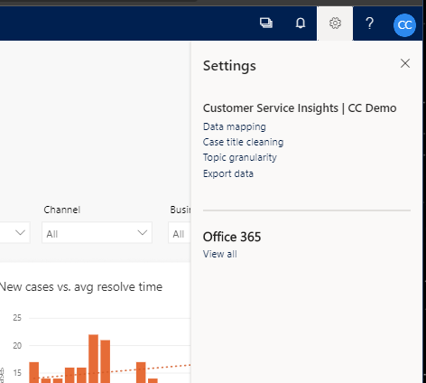
There are several options to configure your data, available in the customer service insights settings, top right.
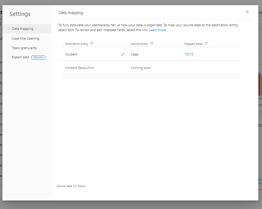
Data Mapping
Data mapping allows customisation of the mapping of the fields required by CSI to your data. By default, this maps the OOTB fields on the Case entity to those expected. You could use a different entity to case in your organisation or map topic to a separate field, for instance.
Clicking on the pencil to edit the configuration firstly allows selection of an entity.
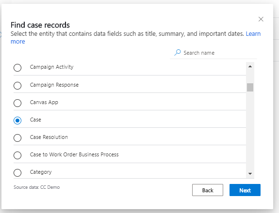
Once this is done, hit Next to map the fields that are required, on the left, to those in the entity selected.
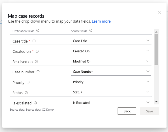
To ensure effective use of the tool, make sure all 15 fields are mapped correctly. This is pretty straight forward if you use the OOTB Case (Incident) entity and fields.
Case Title cleaning
A lot of organisations have a set configuration for their case titles. This is typical when the title is populated with parts of the case such as subject or category selection. CSI allows you to denote these parts so that they are ignored when it builds up the topic categorisation.
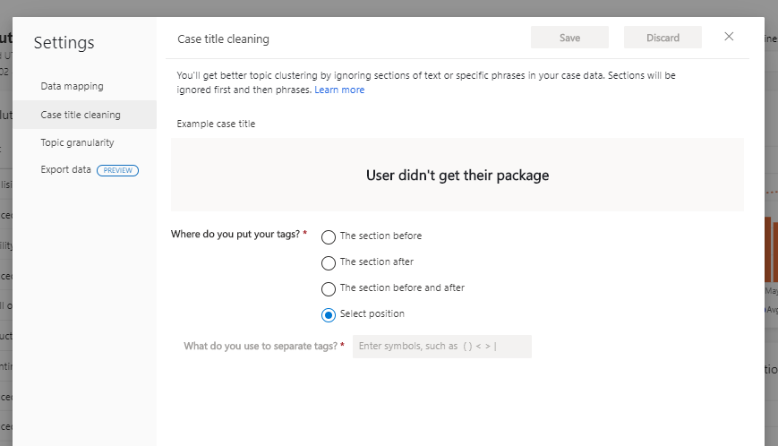
By default the whole of the title is used, but you can state that you use tags before, after or both the main part.
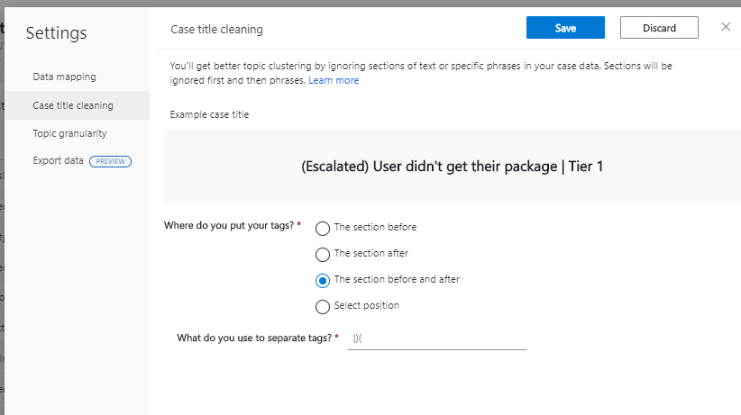
This then allows you to highlight what tags you use to separate the topic from the tags. CSI will then ignore suffixes and prefixes to your title, anything after or before one of the tags.
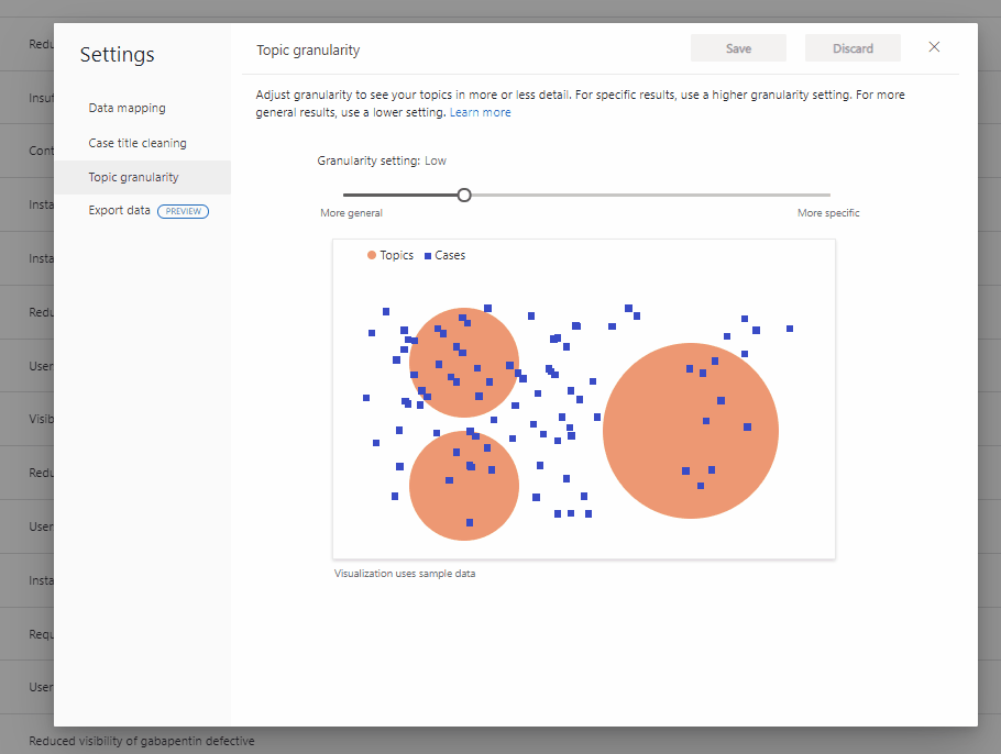
Topic Granularity
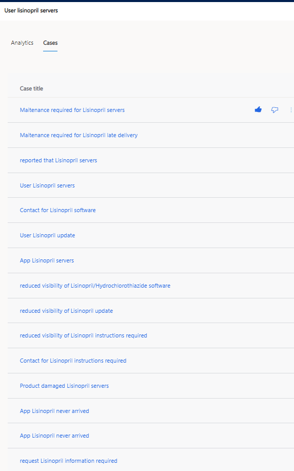
CSI uses the title to group topics. It could use all the words as a unique sentence, but filler words would also be used, which would not group them correctly.
Consider this sample topic that was created using my random data. It is effectively creating a topic from the drug name I used in the centre, rather than taking the whole sentence as the topic. Filler words and their uniqueness is defined by the topic granularity. If you used the highest level of granularity, very high, each unique case title would be used as a topic, reducing the effectiveness of the insights you want to achieve.
It will be down to your data and the fields you are using to decide on the best setting for your granularity. As you change the slide value to high, the groupings become smaller and more unique, using more of the title to drive that uniqueness.
Export Data
This feature is still in preview. This feature allows an external connector to use the data, to go above and beyond the reports given in the OOTB CSI configuration.
A unique URL is generated if you select Generate URL. This is available for anyone to use if they have this URL. The data is refreshed daily. There are also limitations on the number of calls per day that can be made to this API, documented here.
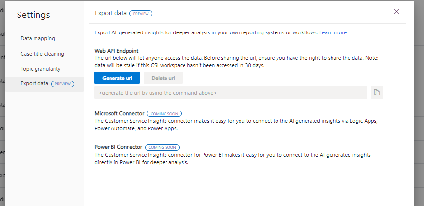
It would be easy to generate your own reports using Power BI or similar tool or have a daily poll to trigger notifications of high case levels etc to supervisors with this endpoint.
To add to Power BI, select Get Data, Web, paste in the generated URL and you have access, nice and simple!
This export of data is the first step, the screen shows that there will be a Power Automate\Power Apps\Logic apps connector, though you could probably use the existing one if you can limit the interaction.
Featured Image by Icons8 Team on Unsplash