This is the fourth in a series walking through the Sales Insights add-on application. The series list is below for your reference.
Basic (Free) Setup - The “free” AI capabilities that can be added to any Sales Instance
Assistant Studio - Full capabilities - The full suite of options for Insight Cards
Productivity Intelligence - Activity and Contact suggestions as well as Notes Analysis
This post will be walking through Connection Insights, which includes Relationship Analytics and Talking Points.
Relationship Analytics
Relationship Analytics uses the data stored in D365 and Exchange, whether accounts, contacts, activities and emails. It then computes numerous KPIs for this data to establish how best to interact with an individual, leading to improved closure rates and customer satisfaction. There is also an analysis of the health of relationships to improve customer retention.
The first step is to enable Relationship analytics and health by clicking the box within the Sales Insights settings app.

Hitting Save (the 2 Data Sources options were not enabled for me) you get a message stating it is being activated.
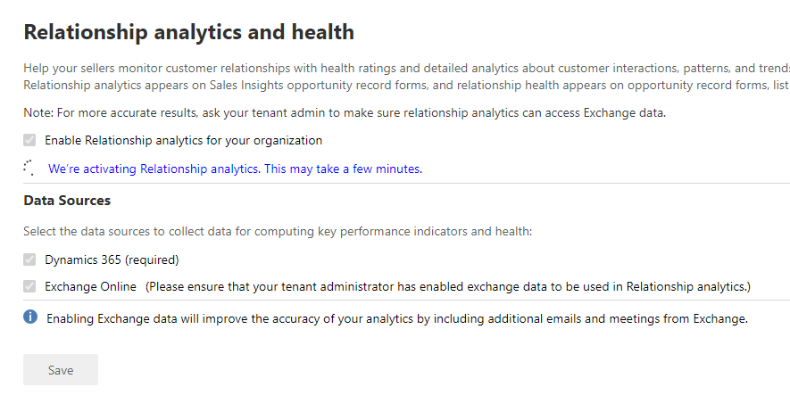
After a short period, a success message is ready to use. At this point I have not changed any settings, including not enabling the Exchange Online configuration, as I would like to see what it is like without Email data.
For the sales user, there is a new View available against opportunities, namely My Open Opportunities by Relationship. On first use, this is not very impressive.

Relationship health is done by looking at the frequency and type of interaction with the customer regarding the opportunity. By adding in some data (this is a demo system so data is not available) the view becomes a lot more usable.
In this instance, data is added to the opportunity. You will also notice that a new section to the Opportunity form is has appeared. This section is giving me a visual representation of the health and indication when the next and last interactions were.

The KPIs are not populated straight away, it states it could be a couple of hours behind, so be patient. You will see the Relationship Health State (KPI) populated with the Health Computation in Progress which indicates it has enough data to provide a value.
Once calculated, the control on the form is updated
Further, the view is giving you a visual indication across your opportunities

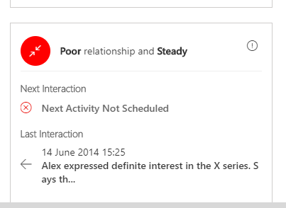
Unfortunately, the data I entered wasn’t enough to make the relationship anything except poor! As you add more activity, this changes. I think on a 12 hour cycle, but can not confirm.

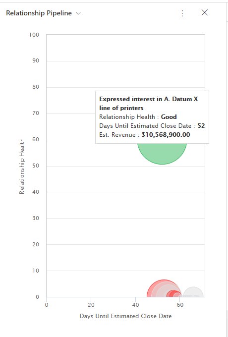
Also, now it is a little more insightful and realistic, let’s look at the chart that comes with the solution. Click on Show Chart and select Relationship Pipeline.

This chart shows all the deals that are due to close and plots them along with their relationship health. The bigger the circle, the larger the revenue. You can also hover over a point to see those key metrics. Pretty!
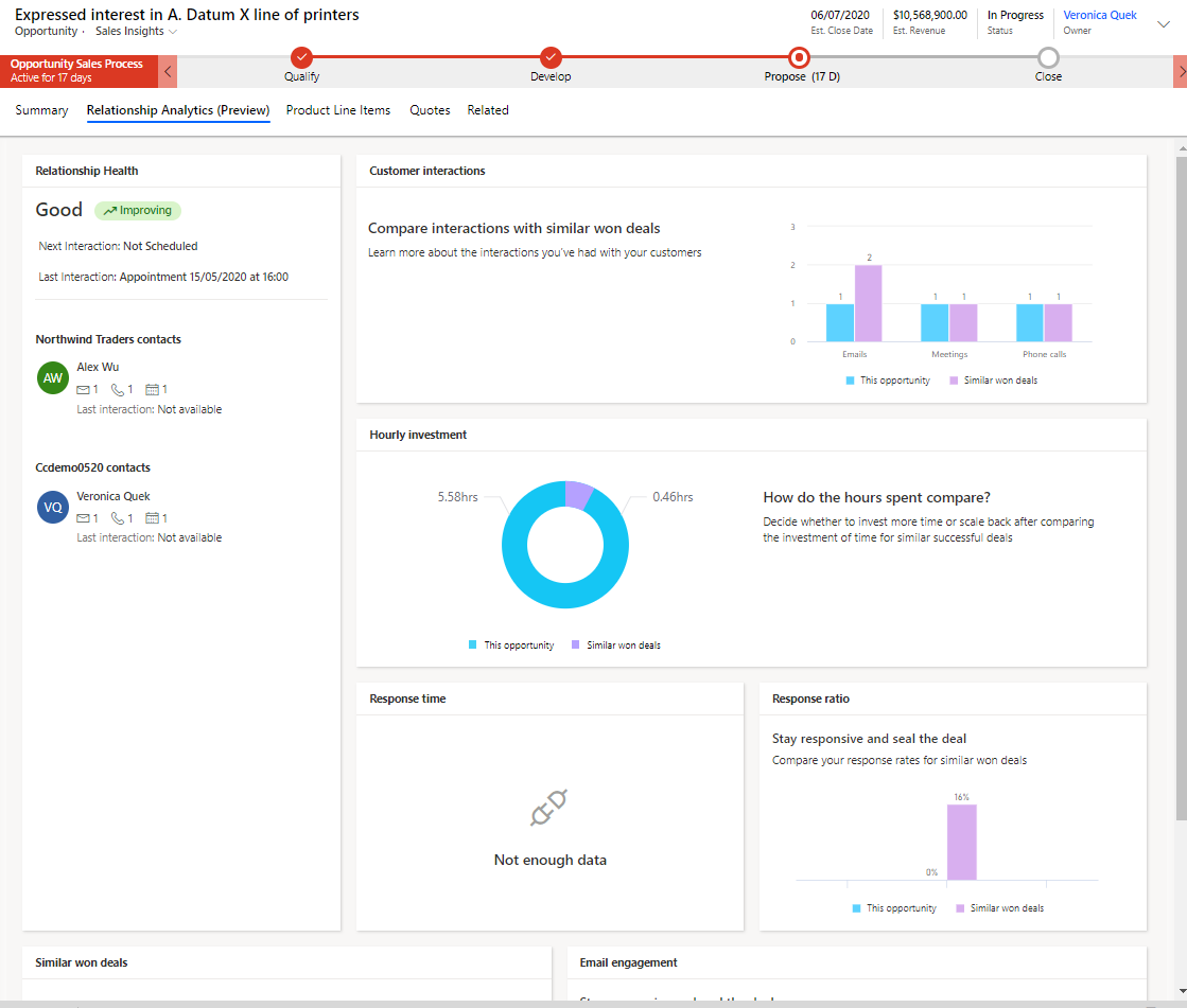
Digging further into some of the tools, along with the control on the Opportunity record, there is a new tab, Relationship Analytics.

This is a great, one stop shop to look at the activity on the opportunity and how it is improving over time. Top left is the same content you seen on the first tab. Next is the count of Interactions that have occurred on this opportunity, split between us, your employees, and them, your customers.
The top right shows the time spent on the Opportunity, a count of the hours spent in appointments or tasks, again split between us and them. Us is calculated by multiplying the length of the activity by the number of employees were part of the activity. Them does not do this calculation and is just a summation of the length of the activities where they were involved.
Email Engagement relies on the Email Engagement functionality discussed in a previous post. It shows all emails that were sent to and from the customer and how many were opened etc. Response rate measures the ratio of emails we sent to the customer which they responded to and vice-versa. This also comes from the Response time, which is the next chart.
Most contacted displays the contacts that have been included on meetings, calls or emails regarding this opportunity. This is duplicated for who has sent the most emails etc in Most Contacted By.
Finally, the Relationship Activities lists when activity has taken placed, the create date for activities over the lifetime of the Opportunity.
This tab is pretty useful and will come into its own when you have the data to support it. We all know the more you speak to a client the more likely an opportunity will be successful. The likelihood of a deal being lost where the customer continues to respond frequently and quickly is pretty slim.
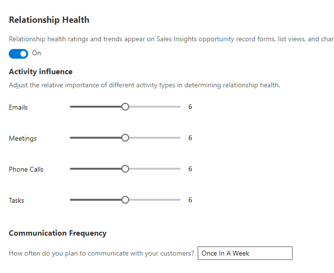
Fine-tuning the results
Microsoft has provided you with a way of “tweaking” the results of the KPIs by rating the relative influence of each activity type. This will depend on your business and how it operates. For a B2C business, I would suggest that email or phone calls would be normal, and a meeting would normally be rare and infer a good relationship with the customer. B2B these would be different, with meetings more common.
Relationship Analytics with similar opportunities (preview)
There is a preview addition to the Sales Insights tools, namely relationship analytics with similar opportunities. There is a warning when you enable this feature that you need to have at least 30 each of won and lost opportunities to allow the new KPIs to be available.

In that spirit, I created a Flow to generate the data. The flow asks for a number, then creates that number of opportunities for each active account with that number of activities, a random mix of emails, meetings, tasks & calls against each opportunity. It then closes the opportunity, either won or lost, with a roughly 60% spilt for won.
You can find the flow as well as the other tweaks I made to my environment in GitHub here.
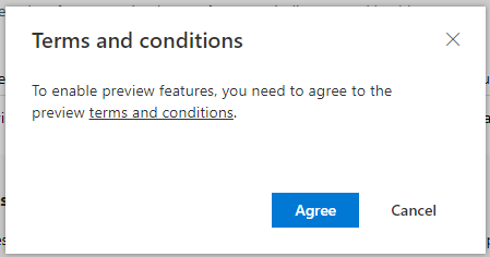
By enabling the preview, you have to agree to the terms.
On the Opportunity screen now, the Relationship Analytics tab is replaced with Relationship Analytics (Preview) and is significantly improved, comparing your opportunity with the historic data.

Talking Points
Small talk is a method of embedding you with a customer or lead. If they think you are friendly and discuss more than just the product or deal, then it has been proven to increase the likelihood of winning a contract. Remembering all your client’s insignificant details, and not confusing customers is hard work. Great salespeople make notes on each client and keep them updated. Dynamics eases this pain by scanning your email and highlighting to you details about the customer which you can use to improve your relationship with them.
These talking points are using the individuals’ email, which is private to them, so any points that displayed are specific to the individual sales user.
Back in the Sales Insights settings, an administrator can enable talking points and also which categories to use.

There is one more thing you need to do to enable this, and it isn’t documented. Thankfully Priyesh Wagh steered me straight in his blog article for D365 DeMystified. Thanks, Priyesh!
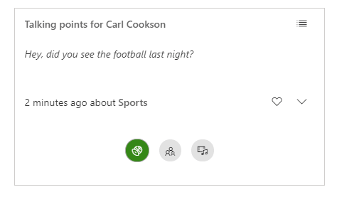
The relationship analytics solution adds a control to the contact form, namely TalkingPoints_section. This needs making visible by default, the form published an then you will see in the contact form a new section. This is populated with parts of an email I sent in.
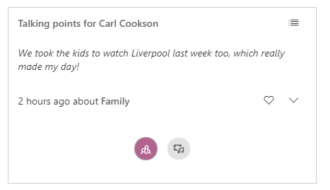
Each of the icons in the bottom represents the categories that have been found in the email that you have with the contact. If you click on an icon, the relevant snippet is shown. Further you can choose to view this in carousel view, the default, or list view by clicking on the icon top right.
Lastly, by selecting the drop down arrow, the full email is displayed, where the user can click on the hyperlink to go to that email.